


.svg)
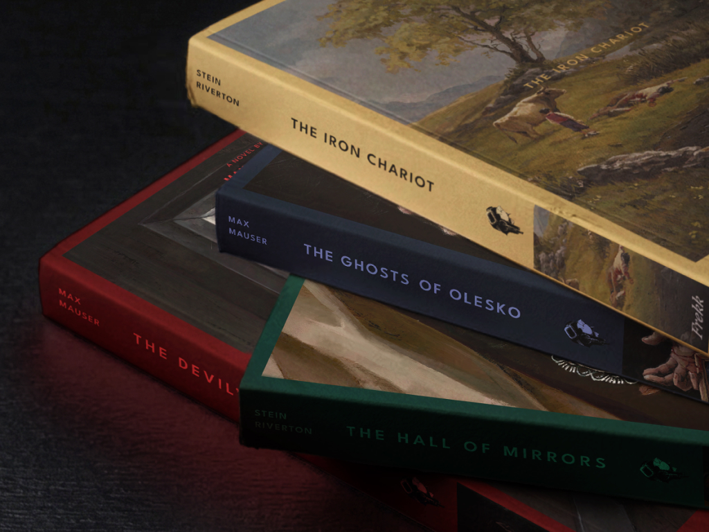
The importance of a good spine
Most books in a physical store are shelved spine-out. The front cover is facing a wall. What the reader actually sees is a strip of colour, a title, and an author name. This is where books get discovered in bookshops. So if you want people to find yours, it's worth taking seriously.
Here are the principles we work from:
Start with clear hierarchy
The title should dominate. The author name sits below it, and the publisher logo anchors the bottom. By the time someone sees your book on a shelf, they have probably already encountered it somewhere else. A social media ad, a window display, a recommendation from a friend. The spine is rarely the first introduction, so the title needs to be immediately clear. What you're really asking the reader to do is recognise something they've already seen.
If your cover is recognizable, use the spine to remind people
Carry the visual language of your cover onto the spine. The colours, the type style, the overall feel. If someone has already seen the cover somewhere online or in a window display, the spine should be enough for them to think: that's the one.
The Penguin Clothbound Classics are a great example of this. Designed by Coralie Bickford-Smith, each book has an intricate foil pattern pressed into cloth, with a consistent two-colour palette. When you spot one on a shelf you know instantly what it is.

Series design is where spines really shine
There's something genuinely satisfying about a well-designed series lined up on a shelf. When the spine design is strong, the books do the collecting for you. People come back for the next one partly because they want the shelf to look right. Give readers a reason to want the full set, and the series sells itself.

Frekk
